
Two years ago, I built my first portfolio website using WordPress and Elementor.
I’d spent a little over a year by that point creating passion projects and I wanted to have a place of my own to display them on the internet.
I tried using a few website building platforms which all promised me ease of use and quick results, but I soon realised that I wasn’t getting closer to achieving the results I wanted.
I felt as though my progress was being slowed down instead of sped up.
I’d heard about WordPress a few times since then but whenever I had tried using it in the past, it seemed a bit old-fashioned to me, and I couldn’t understand how to use it.
But since my previous efforts with website builders weren’t successful up to that point, I figured, “Why not try WordPress again?”
WordPress is a content management system that’s been around for over two decades, so there must be a good reason why it’s still considered relevant. (I later discovered five reasons why WordPress is still a platform worth using. Read about them here).
I came across a few tutorials on YouTube which demonstrated that anyone could use WordPress together with Elementor’s website building plugin to create a website of their own.
So, I used my previously hand-coded website which was already being hosted on Hostinger, and utilised their built-in WordPress integration, along with Elementor to rebuild my website.
It was a major learning experience for me as I figured it all out via tutorials and experimentation.
In the end, I had a responsive, functional portfolio website.
That website was simple in its design, but I was proud of it because it was a product of my labour and I’d learnt a new platform in the process.
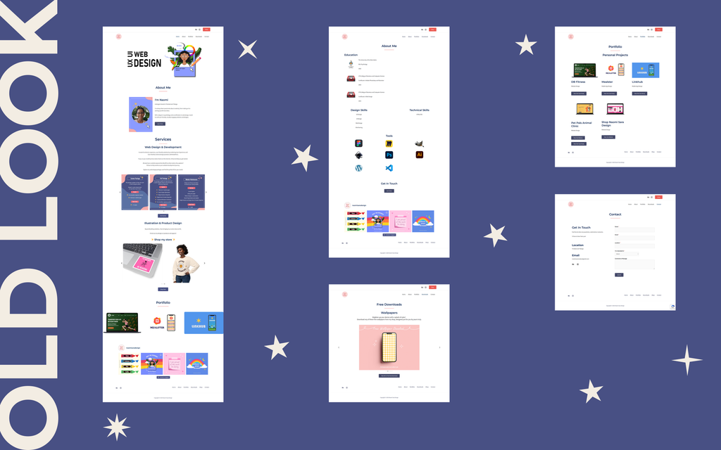
Since then, almost two years had gone by, and I decided that my website was in need of a bit more colour and personality. So I recently went ahead and gave it a bit of a makeover.
And I’m going to share the process behind it with you.
Before even beginning to think about the look of the website, it was important for me to consider what would be on the website in the first place. So the first thing I did was write down the needs, goals and content of the website.
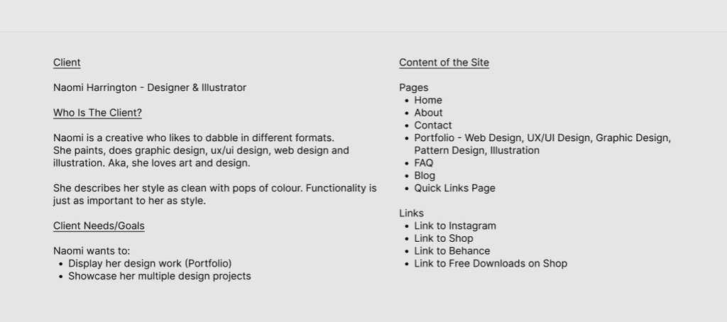
After all, behind the visual design, a website’s purpose is to convey information. So I needed to figure out what I wanted the website to say.
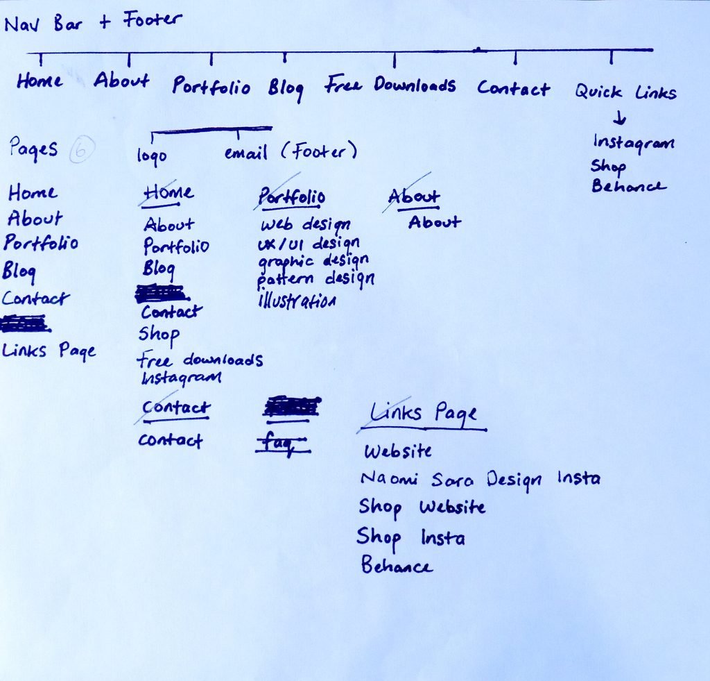
Once I had this figured out, I was able to create the Information Architecture of the website. In this case, the sitemap.
This was important as it allowed me to establish the flow of the information on the website and gave me a visual representation of how the links and pages of the website were connected, which kept me anchored as I built it.
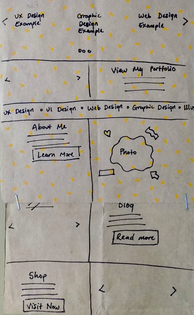
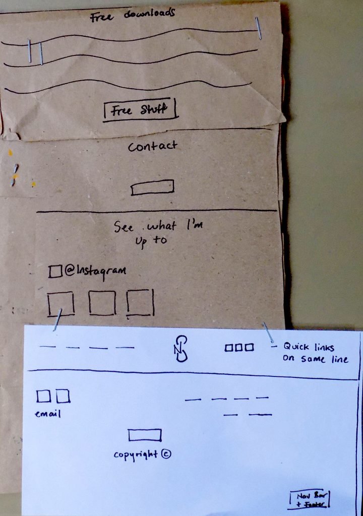
Once the structure of the website was established, I was able to begin thinking about what I wanted each page to look like.
This involved quick, simple sketches on paper to help me determine the overall layout I was after.
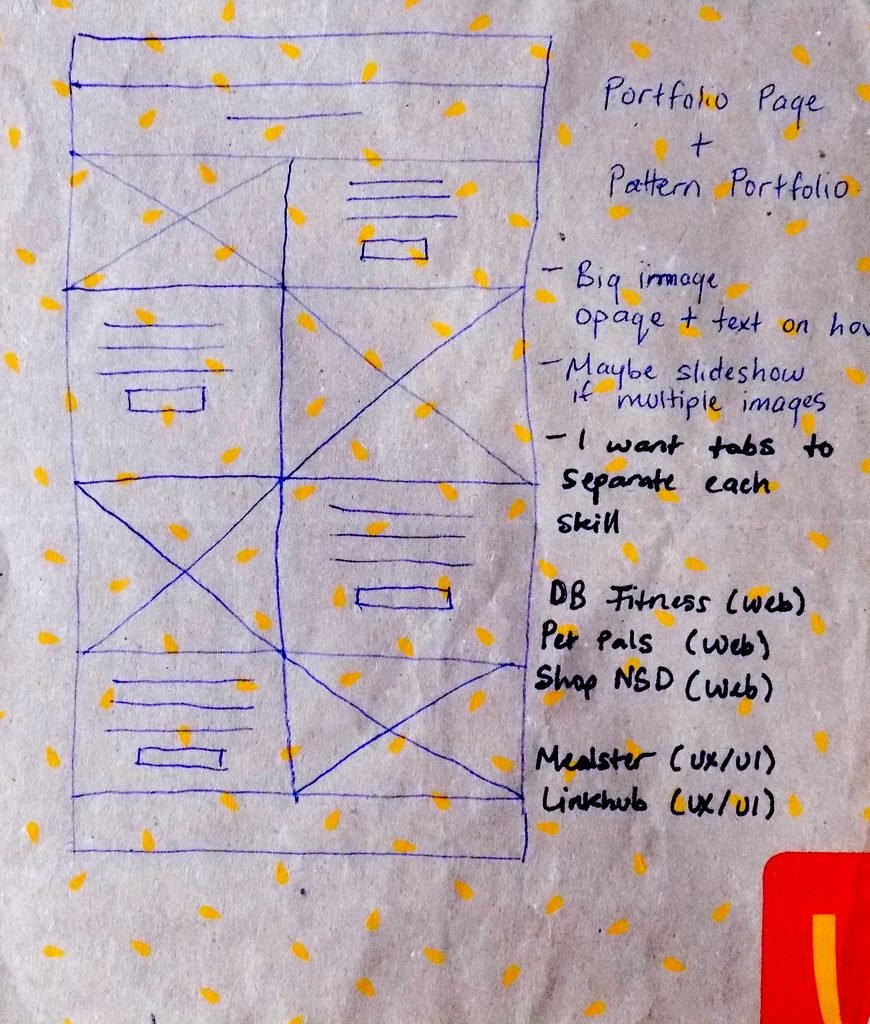
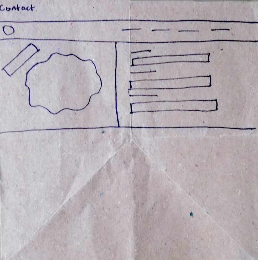
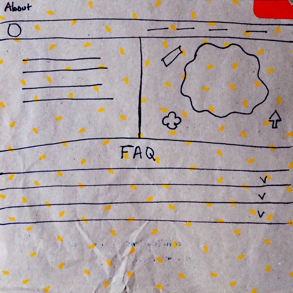
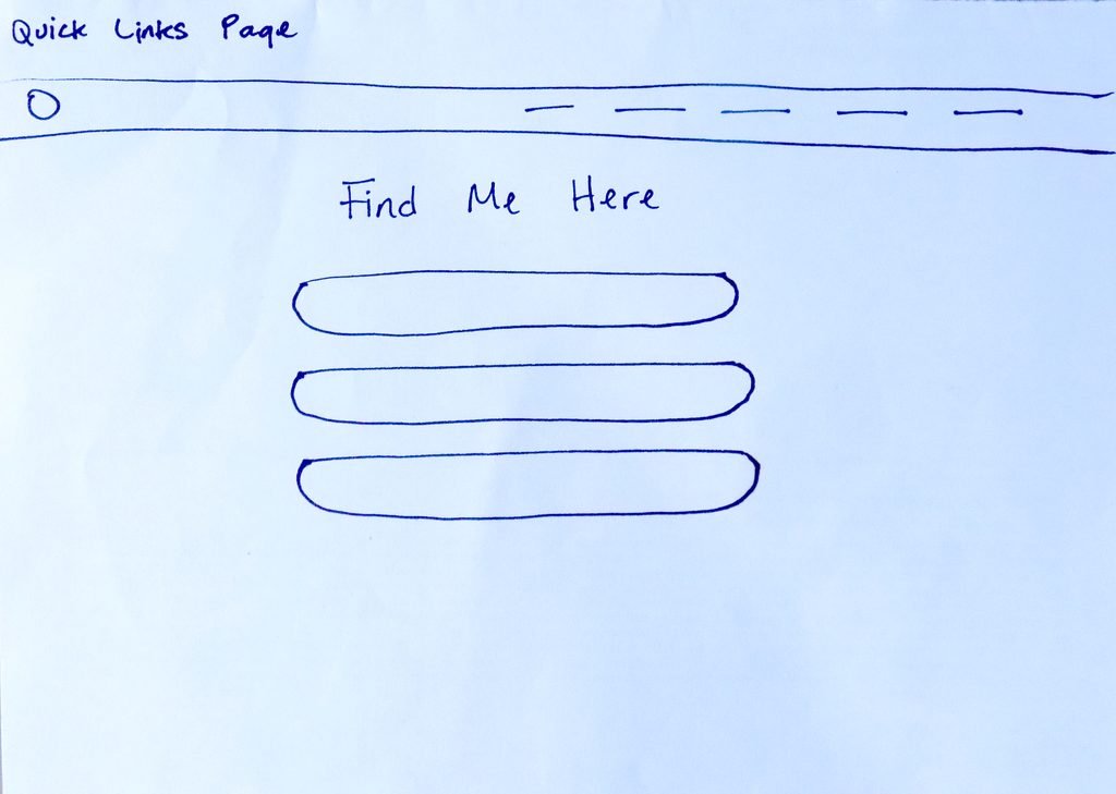
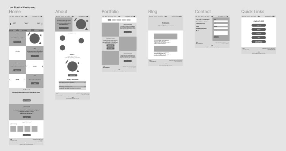
With the layout decided, I created some low-fidelity wireframes, based on my previous sketches.
This helped me to have a clearer visual of where each element would be positioned and I began including the copy as well (aka, the text I wanted on each page).
These continued to be simple and were done in greyscale in order to minimise the chances of being distracted by colour and other visual elements.
Once satisfied with my foundation, I was free to move forward with the visual design of the website. It was like building a house and finally getting the opportunity to decorate it.
I began consulting pieces of inspiration and considered the overall tone and feeling I wanted the website to emit. I knew I wanted something fun and colourful to draw the eye, but with a personal touch.
With that thought in mind, I opened Inkscape and began creating some vector assets to include on my website.
I considered the main colour palette I wanted to utilise, and in reality, what you see on the website now was not my first choice, or one of my choices at all.
I considered other options similar to previous work I had done but figured they were a little too safe. One of the main reasons I wanted to redesign my original website was because, in my opinion, it felt too bland and contained too much negative space.
So when the contrasting plum-yellow colour combination came to mind, I couldn’t resist the urge to try it out.
I used this as my base, building all the other elements around it in Inkscape to create my high fidelity wireframes, which included a visual design of what each finished website page should look like.
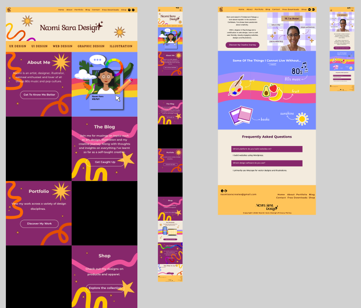
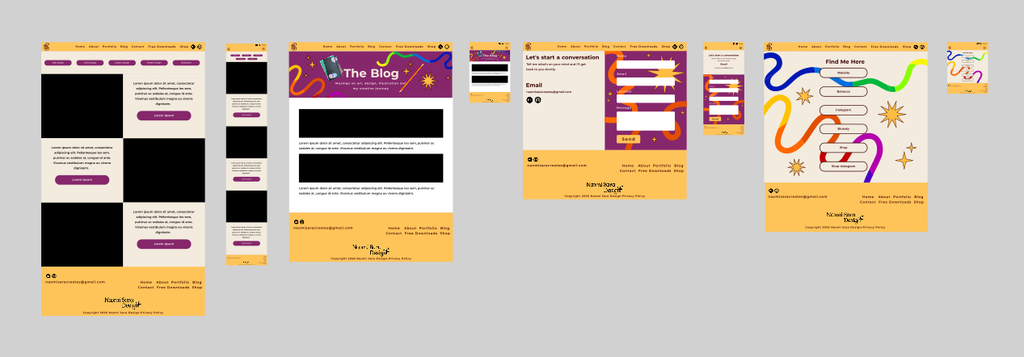
With that covered, I had a final blueprint I could follow that would make building much easier. All that was left to do was to open Elementor and follow the design map I’d created for myself.
As a result, I had a newly updated website that better represents who I am right now and my personality as a designer.
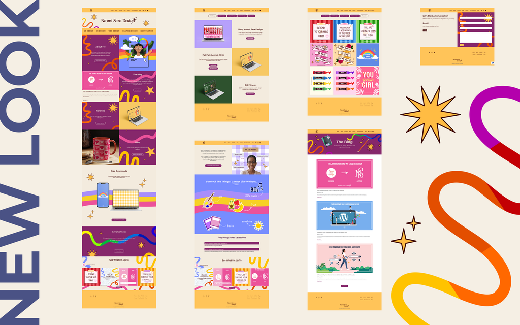
I highly doubt that this will be the last version of my website that I would ever create. Nothing ever really stays the same and as I grow and change, I’ll probably want my website to better reflect that.
But I’m happy with what I managed to create. It feels much more unique and intentional now compared to what it looked like before.
I hope you enjoyed a look behind the scenes of this process and I wish you luck in your next creative project. Whether it’s something brand new or a much needed update of an old favourite.
Happy creating!
Until next time,
Naomi